Color Clustering in Python
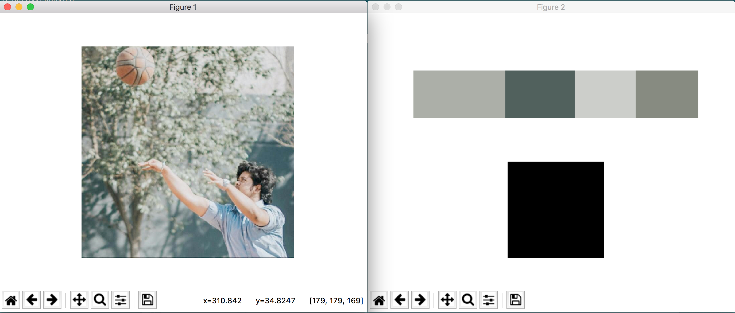
Take a look at the MARVEL logo below. you can probably figure out the most dominant colors in a second. We cleary see Black,...
Read More


Published on Apr 13, 2020 by Kabir Das on Machine Learning, Neural Network, Clustering, Big Data
Customers are the driving force for the revenue in a majority of business that might pertain to mass consumerables or individualized offerings.
But in today’s day and age leveraging Technology is a must. It’s a powerful means to identify unsatisfied customer needs that wont just boost the revenue but help outperform the competitors. Now wouldn’t that be a treat.
Ka-Ching $$
The most common aspects of analyzing customer data :
We own a business dealing with a fuck ton of customers. We want to categorise and segment them so that the marketing strategy can be planned accordingly
We will be using something called the K-Means clustering algorithm.
In a gist, what it does is :
Without further ado, I will jump into the working and execution of the solution.
import numpy as np
import pandas as pd
import matplotlib.pyplot as plt
import seaborn as sns

df = pd.read_csv("customers.csv")
df.drop(["CustomerID"], axis = 1)
df.head()
| CustomerID | Gender | Age | Annual Income (k$) | Spending Score (1-100) | |
|---|---|---|---|---|---|
| 0 | 1 | Male | 19 | 15 | 39 |
| 1 | 2 | Male | 21 | 15 | 81 |
| 2 | 3 | Female | 20 | 16 | 6 |
| 3 | 4 | Female | 23 | 16 | 77 |
| 4 | 5 | Female | 31 | 17 | 40 |
I’ve added the dependencies and the sample dataset with a few attributes. I have also dropped the ID column as it doesn’t really affect in this context.
plt.figure(figsize=(10,6))
plt.title("Ages Frequency")
sns.axes_style("dark")
sns.violinplot(y=df["Age"])
plt.show()
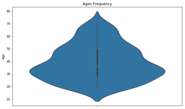
I’ve tried a simple visualization with the age groups to get a gist of where we might be headed !
plt.figure(figsize=(15,6))
plt.subplot(1,2,1)
sns.boxplot(y=df["Spending Score (1-100)"], color="red")

plt.subplot(1,2,2)
sns.boxplot(y=df["Annual Income (k$)"])
plt.show()
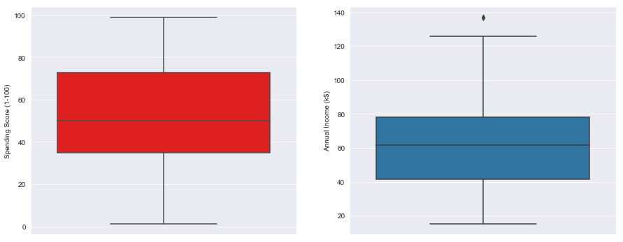
I’ve tried making a basic visualization in the distribution ranges between Income and Spending score
genders = df.Gender.value_counts()
sns.set_style("darkgrid")
plt.figure(figsize=(10,4))
sns.barplot(x=genders.index, y=genders.values)
plt.show()
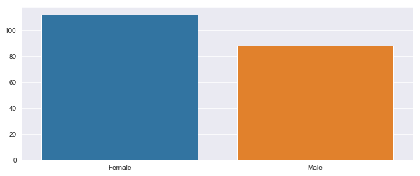
And while we’re at it, try and give the “Feminists” out there something to bash on me about. In layman’s terms, we have tried visualizing the Gender specific spending distribution
age18_25 = df.Age[(df.Age <= 25) & (df.Age >= 18)]
age26_35 = df.Age[(df.Age <= 35) & (df.Age >= 26)]
age36_45 = df.Age[(df.Age <= 45) & (df.Age >= 36)]
age46_55 = df.Age[(df.Age <= 55) & (df.Age >= 46)]
age55above = df.Age[df.Age >= 56]

x = ["18-25","26-35","36-45","46-55","55+"]
y = [len(age18_25.values),len(age26_35.values),len(age36_45.values),len(age46_55.values),len(age55above.values)]

plt.figure(figsize=(15,6))
sns.barplot(x=x, y=y, palette="rocket")
plt.title("Number of Customer and Ages")
plt.xlabel("Age")
plt.ylabel("Number of Customer")
plt.show()
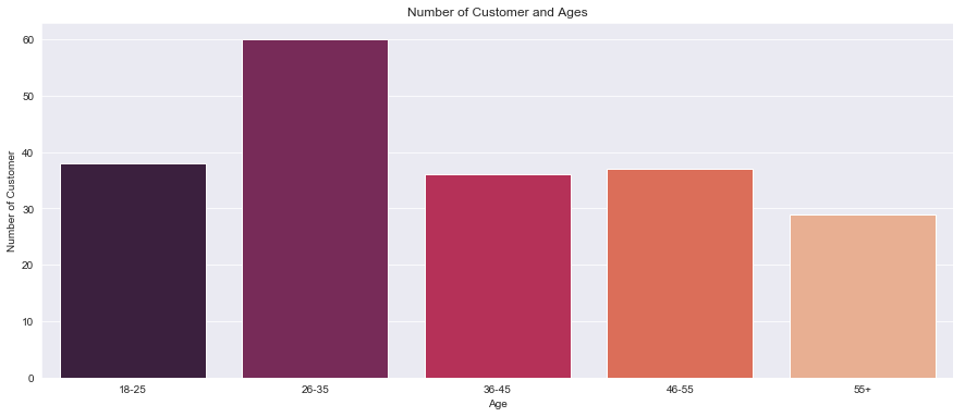
Here, we are trying to get a rough idea on the distribution of customers in each age group.
ss1_20 = df["Spending Score (1-100)"][(df["Spending Score (1-100)"] >= 1) & (df["Spending Score (1-100)"] <= 20)]
ss21_40 = df["Spending Score (1-100)"][(df["Spending Score (1-100)"] >= 21) & (df["Spending Score (1-100)"] <= 40)]
ss41_60 = df["Spending Score (1-100)"][(df["Spending Score (1-100)"] >= 41) & (df["Spending Score (1-100)"] <= 60)]
ss61_80 = df["Spending Score (1-100)"][(df["Spending Score (1-100)"] >= 61) & (df["Spending Score (1-100)"] <= 80)]
ss81_100 = df["Spending Score (1-100)"][(df["Spending Score (1-100)"] >= 81) & (df["Spending Score (1-100)"] <= 100)]

ssx = ["1-20", "21-40", "41-60", "61-80", "81-100"]
ssy = [len(ss1_20.values), len(ss21_40.values), len(ss41_60.values), len(ss61_80.values), len(ss81_100.values)]

plt.figure(figsize=(15,6))
sns.barplot(x=ssx, y=ssy, palette="nipy_spectral_r")
plt.title("Spending Scores")
plt.xlabel("Score")
plt.ylabel("Number of Customer Having the Score")
plt.show()
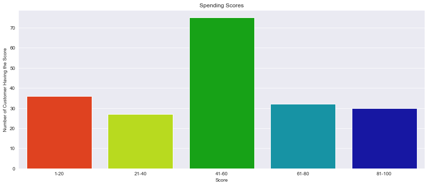
Here, we will be trying to analyze a crucial facet viz. thats the number of customers according to their spending habit.
ai0_30 = df["Annual Income (k$)"][(df["Annual Income (k$)"] >= 0) & (df["Annual Income (k$)"] <= 30)]
ai31_60 = df["Annual Income (k$)"][(df["Annual Income (k$)"] >= 31) & (df["Annual Income (k$)"] <= 60)]
ai61_90 = df["Annual Income (k$)"][(df["Annual Income (k$)"] >= 61) & (df["Annual Income (k$)"] <= 90)]
ai91_120 = df["Annual Income (k$)"][(df["Annual Income (k$)"] >= 91) & (df["Annual Income (k$)"] <= 120)]
ai121_150 = df["Annual Income (k$)"][(df["Annual Income (k$)"] >= 121) & (df["Annual Income (k$)"] <= 150)]

aix = ["$ 0 - 30,000", "$ 30,001 - 60,000", "$ 60,001 - 90,000", "$ 90,001 - 120,000", "$ 120,001 - 150,000"]
aiy = [len(ai0_30.values), len(ai31_60.values), len(ai61_90.values), len(ai91_120.values), len(ai121_150.values)]

plt.figure(figsize=(15,6))
sns.barplot(x=aix, y=aiy, palette="Set2")
plt.title("Annual Incomes")
plt.xlabel("Income")
plt.ylabel("Number of Customer")
plt.show()
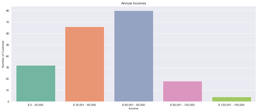
Lastly, we have visualized the number of customers againsts their incomes.
# df["Gender"] = df["Gender"].map({'Female' : 0, 'Male' : 1})
df = df.replace(to_replace ="Female", value = 0)
df = df.replace(to_replace = "Male", value = 1)
df.dtypes
df
| CustomerID | Gender | Age | Annual Income (k$) | Spending Score (1-100) | |
|---|---|---|---|---|---|
| 0 | 1 | 1 | 19 | 15 | 39 |
| 1 | 2 | 1 | 21 | 15 | 81 |
| 2 | 3 | 0 | 20 | 16 | 6 |
| 3 | 4 | 0 | 23 | 16 | 77 |
| 4 | 5 | 0 | 31 | 17 | 40 |
| ... | ... | ... | ... | ... | ... |
| 195 | 196 | 0 | 35 | 120 | 79 |
| 196 | 197 | 0 | 45 | 126 | 28 |
| 197 | 198 | 1 | 32 | 126 | 74 |
| 198 | 199 | 1 | 32 | 137 | 18 |
| 199 | 200 | 1 | 30 | 137 | 83 |
200 rows × 5 columns
from sklearn.cluster import KMeans
wcss = []
for k in range(1,11):
    kmeans = KMeans(n_clusters=k, init="k-means++")
    kmeans.fit(df.iloc[:,1:])
    wcss.append(kmeans.inertia_)
plt.figure(figsize=(12,6))
plt.grid()
plt.plot(range(1,11),wcss, linewidth=2, color="red", marker ="8")
plt.xlabel("K Value")
plt.xticks(np.arange(1,11,1))
plt.ylabel("WCSS")
plt.show()
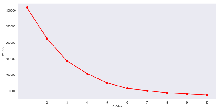
Now, We’ve plotted Within Cluster Sum Of Squares (WCSS) against the the number of clusters (K Value) to figure out the optimal number of clusters value. WCSS measures sum of distances of observations from their cluster centroids which is given by the below formula.
where Yi is centroid for observation Xi. The main goal is to maximize number of clusters and in limiting case each data point becomes its own cluster centroid.
Ignore if too technical
km = KMeans(n_clusters=5)
clusters = km.fit_predict(df.iloc[:,1:])
df["label"] = clusters

from mpl_toolkits.mplot3d import Axes3D
import matplotlib.pyplot as plt
import numpy as np
import pandas as pd

fig = plt.figure(figsize=(20,10))
ax = fig.add_subplot(111, projection='3d')
ax.scatter(df.Age[df.label == 0], df["Annual Income (k$)"][df.label == 0], df["Spending Score (1-100)"][df.label == 0], c='blue', s=60)
ax.scatter(df.Age[df.label == 1], df["Annual Income (k$)"][df.label == 1], df["Spending Score (1-100)"][df.label == 1], c='red', s=60)
ax.scatter(df.Age[df.label == 2], df["Annual Income (k$)"][df.label == 2], df["Spending Score (1-100)"][df.label == 2], c='green', s=60)
ax.scatter(df.Age[df.label == 3], df["Annual Income (k$)"][df.label == 3], df["Spending Score (1-100)"][df.label == 3], c='orange', s=60)
ax.scatter(df.Age[df.label == 4], df["Annual Income (k$)"][df.label == 4], df["Spending Score (1-100)"][df.label == 4], c='purple', s=60)
ax.view_init(30, 185)
plt.xlabel("Age")
plt.ylabel("Annual Income (k$)")
ax.set_zlabel('Spending Score (1-100)')
plt.show()
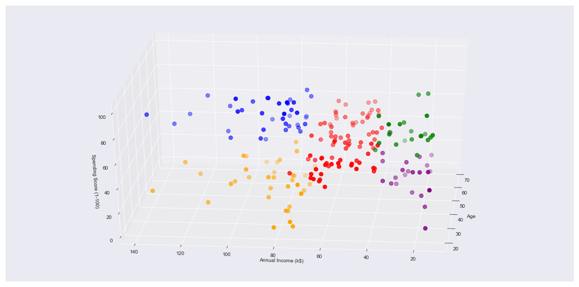
Finally, coming to the result of all these shenanigans. We have made a 3D plot to visualize the spending score of the customers with their annual income.
The data points are separated into 5 classes which are represented in different colours as shown in the 3D plot.
Handing this projection to a well consultant or marketing team will help you achieve wonders!
This gives us a concrete analysis and visualization to better understand out customers and in turn increase the revenue of the company
## Thanks
Take a look at the MARVEL logo below. you can probably figure out the most dominant colors in a second. We cleary see Black,...
Read More
Prologue Customers are the driving force for the revenue in a majority of business that might pertain to mass consumerables...
Read More